New project: Chester Beer Festival 2010
Chester Charity Beer Festival is an annual three-day event that takes place in Chester. Run by Round Table, It raises money for good causes and charities through selling festival tickets and of course beer. You can see the project here.
I had already worked for the festival last year. In 2009, I developed the front cover of the programme, along with some A1 posters that were hung up at the festival. You can see that work here.
Before I began to work with the festival, they did not have any sort of true identity or promotional materials, with most of the posters and programme design being very sporadic each year. With no tight branding integration, the festival was lacking that spark that made it more appealing for people to attend. It was my job to design all of this year’s promotional materials.
The logo
Because 2009’s logo proved to be successful, I decided that instead of starting from scratch, I could use some of the equity of it and update rather than redesign it.
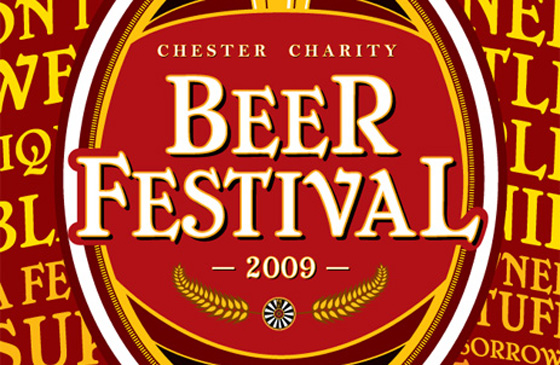
One of the things that was added to the cover last time was Round Table’s own logo, seen above just below “2009”. Because the festival is run by Round Table, I thought it was important to keep this association as part of the new logo as Round Table do much more than host the festival. Eventually, this is what I came up with:
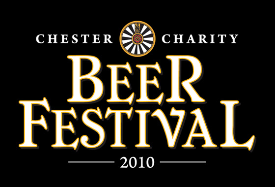
As you can see, it’s quite similar to 2009’s design, but with some improvements including the integration of Round Table’s logo directly into the festival’s logo. There’s also more refinement in the placement and sizing of all of the type. For those that are interested, the fonts being used are Cheboygan and Arno Pro.
The programme cover
With the logo complete, I moved straight onto the cover of the programme, which would be distributed to 2,000 people over the course of three days. Again, using a little equity from last year’s cover, I designed it in the style of a beer label.
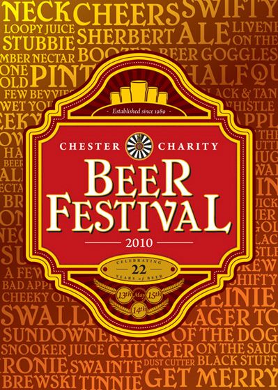
I wanted this label to have much more detail than the 2009’s. Last year, I only had a few weeks to put the cover and poster designs together all whilst getting my coursework done as well. This year, as the project began in February for a May launch, I had more time to put something together. With the programme designed, I could then use design elements from it to influence everything else that needed to be designed.
The poster
The first thing that needed to be designed was the poster so the festival could begin its promotion. I started with something simple as the information that was going on the poster was a little scarce to begin with.
Once I had sent this over, it was clear that there was more information to go onto the poster and everything needed to be reworked for everything to fit on including ticket prices and of course where about the festival was being held. As I was struggling for information, I removed the frame altogether and went for something even simpler.
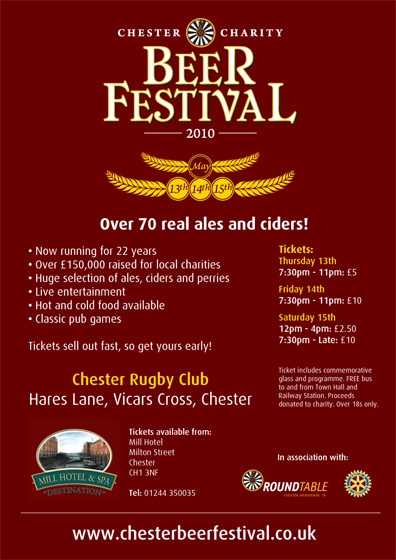
It was pretty clear even as I was designing it that it didn’t feel right. It got across all of the information, but it wasn’t very attractive and it didn’t contain any of the design elements that were present on the programme’s cover. So, I redesigned again.
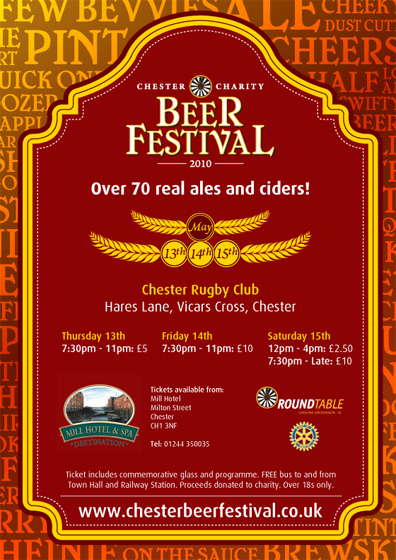
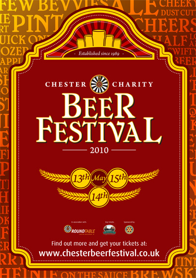
After sending this over to the client, they were happy with it but I felt that there was still something not quite right about it. I felt that the logo was far too small and the dates were out of proportion and it still looked a little empty at the top. So, after another redesign, I ended up with this:
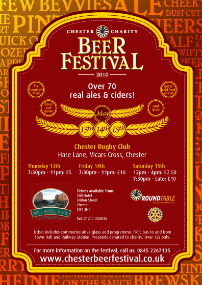
Widening the top half of the frame meant that I could move the logo up and make it a touch bigger. By adding some feature circles, it reduced the amount of blank space that was causing a problem and I could also make the dates a touch bigger to go with the larger logo. After sending this over to the client, we were both happy with it. In total, there were 8 redesigns of the poster that got me to this version.
The t-shirt
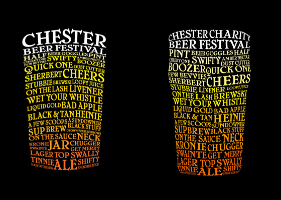
Along with last year’s A1 posters, the client had asked if the design could also be used on t-shirts. Again, at the time, I didn’t have much time to come up with something but what I did come up with was a design that formed a pint glass out of beer-related words. With more time this year, I felt that I could improve on the design and make it look a bit more glass-like, as the previous version looked a little too blocky.
The ticket
With three different nights for the festival, one ticket design wasn’t enough. Not only were there different prices for each ticket, but on the first day, there would be two events. The festival also offers all sponsors of the event free tickets and so a ticket design was needed for that too and so in total, there were 5 tickets designed.
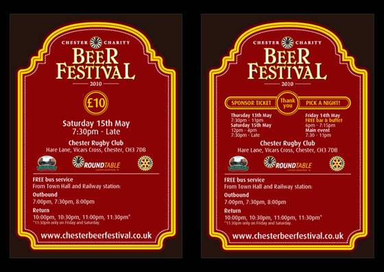
The sponsor ticket proved a bit of an issue to begin with. Sponsors are allowed to attend any of the events that are on over the three days. They’re also invited to the special sponsor’s bar and buffet. All of these days and times needed to be on the sponsor’s ticket which meant reorganising things on all of the tickets to allow for more space for all of the dates and times to be written on the sponsor’s ticket.
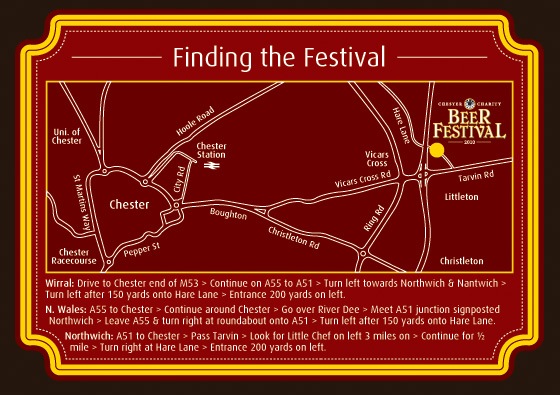
The back contained a map of where the Festival was, with directions from various parts of the surrounding areas.
The beer card
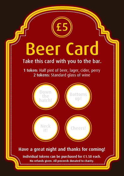
Having attended last year’s festival myself and actually gone through the process of going to the bar area to get a drink, I quickly discovered how annoying it was carrying around 3cm wide raffle tickets which were very likely to get ripped or simply lost. The client had asked me to come up with a better way of exchanging money for tokens for beer. Initially, I advised that it probably wasn’t worth redesigning the tokens because ultimately, they were going to get thrown away anyway a few minutes after being purchased. However, after a bit more thought, I realised that there was a good opportunity to come up with a better concept of mere tokens.
Since the price of the beer tokens had already been set at £5 for 4 beer tokens, there was no need to have any less than that. In other words, regardless of how many tokens you might want, you always bought in sets of four. With this in mind, I came up with the idea of having a beer card, containing four tokens. This way, the card itself could be designed at the same size as the ticket (A6) on card. This meant no more misplaced tokens or tokens torn because they had been covered in beer. Additionally, instead of giving in a raffle ticket, the customer would give in the card, have it marked by the bartender and then have it given back. The client really liked this idea and so I went ahead and designed it.
The programme
With everything else out of the way, the programme was the last thing to design. Although the festival began on May 13th, I had to wait until May 1st to design it because there were sponsor adverts and a full beer list to go in it, which weren’t finalised until late on. The design was influenced by the things I had already designed, using the thick yellow and red frame on each page.
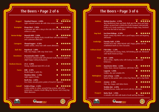
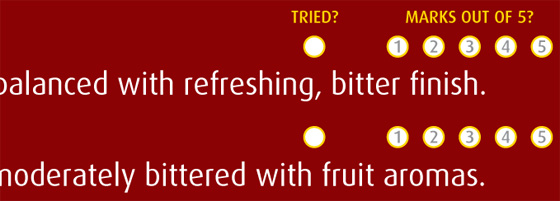
As a final touch, the client asked for a ranking system next to each of the beers as some of the die-hard festival-goers enjoy rating them. Scores were placed next to each of the 70+ beers.
The festival
With everything now designed, it was now time to look forward to 2,000 people descending into Chester to take part in the festival. I decided to take a trip to Chester myself and see my work in action.
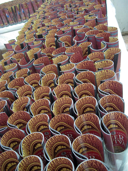
As a designer, it’s always fantastic to see my work ‘live’ and to know that so many people are not only looking at it, but using it, picking it up and reading it. It’s a fantastic feeling to see a room full of people all with the above programme in their hands.
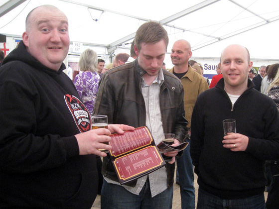
Throughout the evening, I took photos of people having a good time. Thankfully I got some shots of people with the guide in their hands.
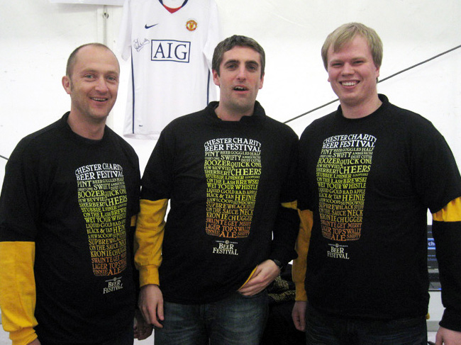
It was also fantastic to see the t-shirts that I had designed on sale at the front of the marquee, as modelled by staff above.
It conclusion, working with the festival has been another fantastic experience. I enjoyed my minor role in working with them last year and I’ve enjoyed developing an entire campaign with them this year even more. In particular, I’m very happy with the beer card idea, which was very successful on the night, as I saw many people buying more than one card every time they bought some. It’s also quite an unusual experience for me as a designer seeing someone hand over money to buy a piece of card which is then valued at £5 each.
As mentioned at the start of this post, the festival’s profits all go to charity. This includes charities such as Claire House, who support families with sick children. Because these types of charities rely so heavily on donations, I decided that early on in the project, I would donate my whole fee to the festival’s fund. I am proud to support the festival for free because I believe that my fee will be put to good use by the charities that the festival supports. It’s also fantastic news that the festival this year raised over £10,000. A great festival and a great cause. I look forward to working with the festival in 2011, should they wish to work together again.
