New project: Claire & Dave Invitations

I have two fantastic friends who, after quite a long time of being engaged decided to finally tie the knot this year on November 27th. As part of their celebrations, they asked me to design their wedding invitations. You can see the final invitation here.
There were a few key requirements for the invite. Firstly, what it must contain. This included some way to RSVP, an invite to the wedding itself, an invite to the evening reception and a poem chosen by the couple.
As the budget was very small, the invite needed to be small enough that it would fit on A4 so they could be printed without any trouble. However, they also liked the idea of using a square format with a gate-fold and with this in mind, I came up with the idea of using a four piece suite of invitations all housed by one larger container.
There were also some requirements as to what the invitations must look like. It needed to have a baby blue theme, must have swirls and must somehow incorporate a butterfly or butterflies. The bride gave me a very simple example of a graphic she had found online as reference. This was the only thing I had to go on but I was confident that I could deliver something that the couple were happy with.
Although not a requirement, I felt that it’d be nice if the invitation had some sort of logo and I thought this would be the perfect opportunity to incorporate the couple’s initials – C&D – into it. My first port of call was of course plenty of sketching.
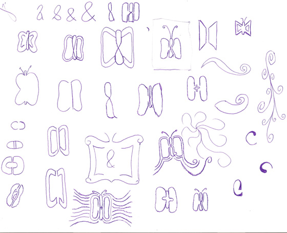
After a number of sketches, I finally came up with a potential way of how to use a C and a D to form a butterfly. It certainly wasn’t going to be as easy as I first thought, however. Currently, it didn’t look anything like a butterfly. More like a strange insect with very large antennae.
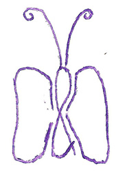
After experimenting further on paper, I felt that I would be better scanning in the above logo and creating it in Illustrator.
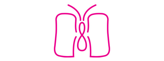
I started to tweak the initial sketch, working on just one side of the illustration and then mirroring it to create a perfectly symmetrical graphic. The problem was that the tail of the ampersand was getting in the way and in the end, I felt that it worked better without it. I also shortened the antennae and tried to harden the outside corners of the two characters. Eventually, I ended up with this:
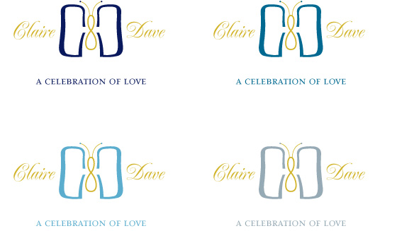
I wasn’t happy with what I had come up with by a long shot and I didn’t feel that this was elegant enough to warrant a place on a wedding invitation. It needed to be softer, more rounded and much more butterfly-like!
This is where many iterations began. My aim was to make the characters look more like wings but retain enough legibility that the characters weren’t lost altogether. I also sought advice on how to refine it to a point where I was happy with it.
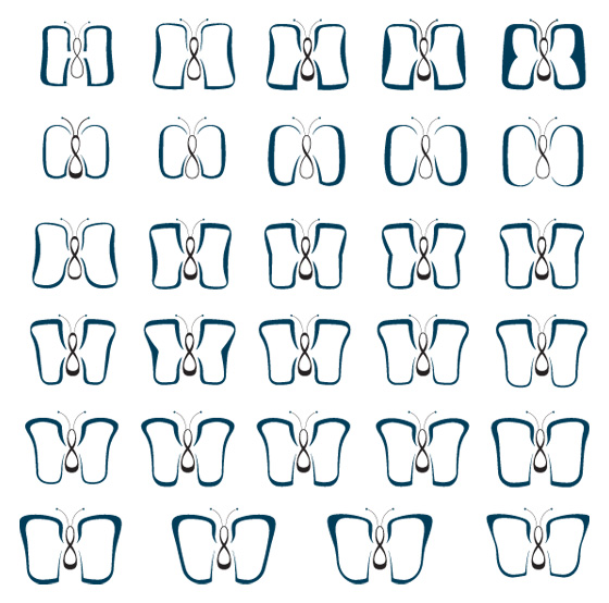
It took a while but I eventually got to where I wanted to be.
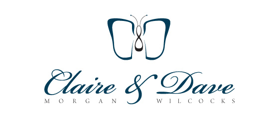
I felt that this logo worked the best because although other iterations looked more like a butterfly, I felt that this one looked like a butterfly and C&D equally.
Once the logo was finished, it was time to work on the invitations themselves.
As mentioned, one of the requirements of the invitation was that it must contain swirls of some sort. With this in mind, I went on a hunt for some interesting flourishes to take reference from and ended up finding an excellent collection of swirls from All Silhouettes.
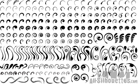
And then the painstaking process began of duplicating and placing all of these swirls over the whole of the page to create a unique pattern and one which had as little repetition as possible. This meant placing each of the swirls individually, rather than copying and pasting whole chunks. It took quite a whole to cover the entire page, but eventually, it was completed.
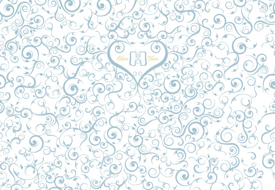
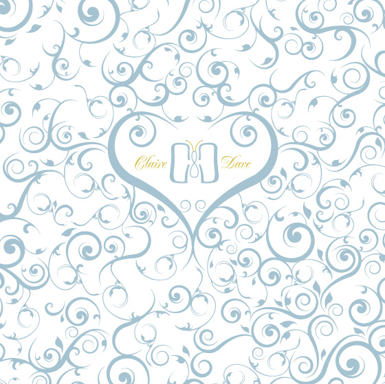
Above is the entire invitation laid out and a crop of just the front of it. I wanted there to be something special on the front as there wouldn’t be able to be anything central on the back due to the way the invitation opened. By using two of the swirls I had already chosen and enlarging them, I was able to form a heart and in it, place the first draft of the logo. I stuck with this idea for quite some time. However, after a while, it felt as if there was something not quite right about it. I felt that although the heart was a good idea, it wasn’t allowing the main element – the logo – to breathe enough and so eventually, the idea was scrapped and I came up with something much lighter. Something with more room to breathe.
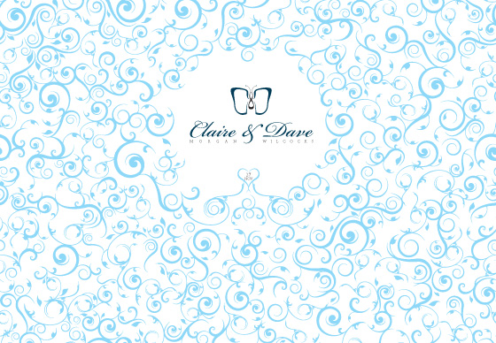
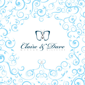
Instead of the heart taking up too much space around the logo, I reduced it right down and instead, used it to house the date of the wedding. I also tweaked the colours so they felt a little more vibrant instead of rainy day and I felt that things were now coming together enough to then move onto the four-piece suite that would be housed within the container.
For each of the pieces of the invitation, the couple had already given me the text including a poem. However, some of the words didn’t quite match the tone of voice of the invitation and I suggested a change, which worked much better both visually and logically when reading. The new text was able to be bigger and a little more spaced out. Some of the invite has been omitted for privacy in these shots.
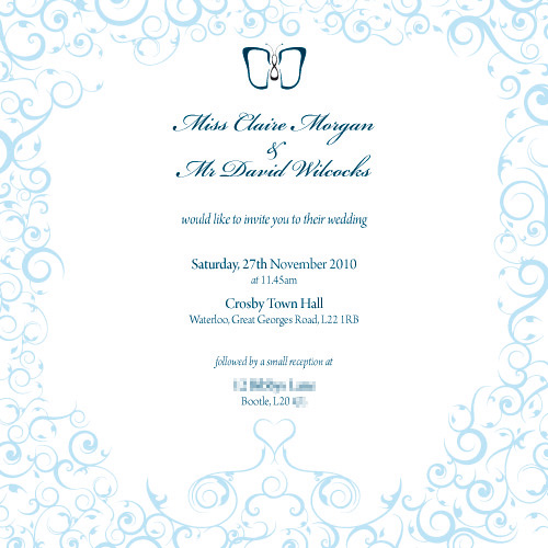
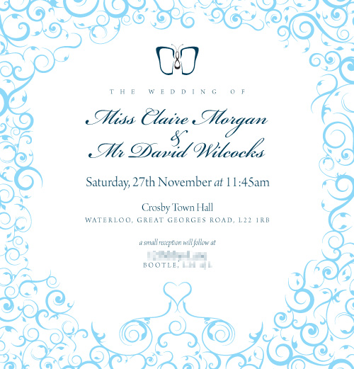
From here, the rest was plain sailing and all came together really well. The last thing to think about was what the invitation could actually be posted in. Luckily, there’s a fantastic site called Square Envelopes which has a fantastic range of, well, square envelopes! Their range happened to include the exact size I needed put one of the invitations.
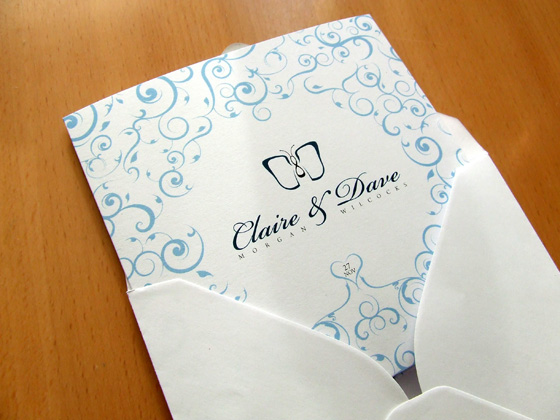
Upon showing Claire and Dave the invitations, they loved them. I feel really lucky and pleased to have helped in some small way to making their wedding a success.
I wish them the best of luck for life.
