The journey to a new train ticket

Over at Daniel Gray’s blog, a simple observation has been made. One which has probably been observed by most of us at one point or another and especially for long journeys – Why can’t I have one train ticket for one trip?

Upon first glance, it’s not a particularly extravagant request. One journey, one ticket. Of course, as we (and by we I mean those in the UK) know, train operators don’t see it this way. If I have three trains to catch in order to get from point A to point B, they see that as three journeys, not one and so issue us with three lots of tickets accordingly. Things get even worse if you plan on returning from your destination as well, as that doubles the amount of tickets! Things get even worse if your travels include seat reservations.

As Daniel points out, it’s absurd. Why can’t I have my entire journey on one ticket? Is that so hard? I’m not so sure it is, but rather train operators have been using the same method of designing/printing tickets for so long that the problems have become compounded as new methods of actually purchasing tickets and/or services come along without any support for them on whatever proof of purchase the operator wishes to give to the customer. In this case, a train ticket.

With the above in mind, I decided to take a stab at what a new ticket could look like. I had a few key goals.

Don’t reinvent the wheel
There are hundreds of trains, stations and ticket vendors in the UK most of which use the same format of ticket. Because of this, there will be tens of thousands of blank ticket stock already printed with the trademark orange trim and Rail Settlement Plan watermark. With public transport already suffering from a lack of investment, no one needs to spend an excessive amount of money getting a new format of train ticket into circulation. Keep the physical ticket that already exists and improve it, rather than starting afresh.

Everything on the ticket needs to be printable
Currently, when you purchase a train ticket, everything besides the orange trim and watermark is printed right there and then. This includes all category headings like “Destination” or “Price”. This means no pre-printed bars/blocks/colours/logos. Why is this important? With more and more people buying their tickets online before they travel, vendors are now supplying all journey-related information on a ticket. This includes a receipt for the ticket and credit card receipt. As time goes on, there will undoubtedly be other uses for the tickets besides the journey itself and it’s important to keep this in mind.

Reduce the need for extra tickets
Again as above, more people are buying their ticket in advance of their journey and that can sometimes mean they’re able to book specific seats and specific trains. Currently, if you do this, you’ll be given a separate ticket for your reservation, along with one for the journey itself. One of the main goals of the ticket redesign is to reduce the need for these extra tickets by including everything on one ticket instead.

Assume all current information is important
It would be easy to discard some information that already exists on today’s train tickets like price (because you’ve already bought it), ticket number (because that’s unimportant to the customer) or the time the ticket was printed. However, one way or another, that information is important at some stage of your journey. It may not be important to you at the time, but may well come in handy for things like lodging a complaint afterwards and being asked to see proof of purchase.

And this is what I came up with.
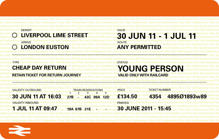
The new ticket design. Information is easier to see at a glance and all on one ticket.

Now, you might be thinking “It doesn’t look much different”, but as I said, my aim wasn’t to reinvent the wheel. It was to solve the main problem of reducing the need for multiple tickets and I believe this does that.

Features

One ticket for one journey – Single or return
This ticket allows the customer to go to and from their destination when purchasing a return ticket, even though there’s only one departure/arrival station. When the customer is asked to present their ticket going to their inital destination (in this case London Euston), the inspector ticks off the arrival station to show that the customer is indeed on the way there. On the way back (in this case to Liverpool Lime Street), the inspector ticks off the departure station. The ticket then has two ticks on it, showing full use.

Most important information at the top
On current tickets, information is spread out in no sensible way. This changes things by placing departure/arrival stations at the top, along with the validity of the ticket.

Multiple seat reservations now on one ticket
Even if your journey has five different trains involved, this ticket will allow you to view your seat reservations for them. If some of your trains don’t have reservations, then that train number has a dash instead of a seat number.

Information moved out of the orange trim
I believe that the orange trim should stay clear as this is a border, not a margin. With that in mind, printing information (along with price and ticket number) have been grouped together, finishing off the ticket in a nicer way.

Works just as well for single journeys
Since some journeys aren’t as complex as a 5-train nightmare, here’s an example of how the ticket would look for those on a single ticket.
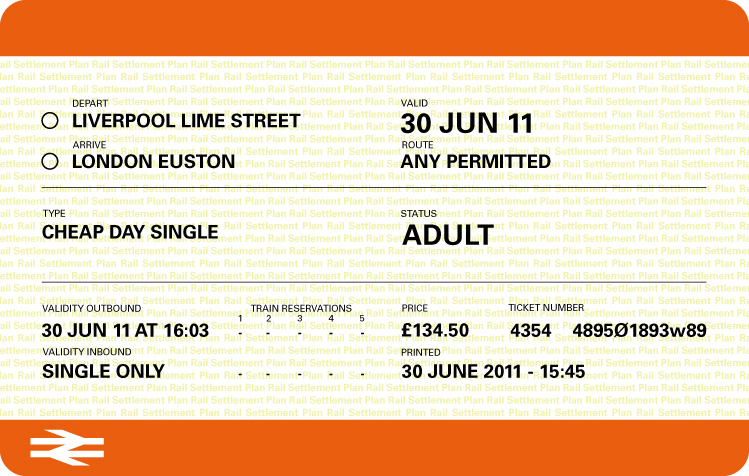
The ticket works just as well if the journey is only a single.

This time, validity is one day only instead of a range of dates with the return. It also shows a zeroing out of all train reservations. This particular ticket would be more likely to be used on inner city train travel, where train reservations aren’t a requirement.

Although this doesn’t introduce anything new from an eye-candy design perspective, I do believe it starts to address the main problem that many people have of too many tickets for a single trip. In fact, the only thing I’ve done is rearranged the information and added one category (train reservations). Everything else is already present on today’s tickets. Granted, I’ve used Univers for the typeface which isn’t going to be available for ticket printing machines, but again, even with the correct typeface being used, I believe this moves one step closer to solving our train ticket problems.

See also: Tyler Thompson’s attempt to redesign a plane boarding pass.

New Project: One Design Show

As mentioned in one of my Tweets, me and my University of Chester graphic design class had an exhibition on June 18th to show off our finest work to design agencies and the public. As part of the promotion of the exhibition, I was tasked to produce it. This included invitations, posters and a website. You can view the work here.

Producing an entire exhibition is certainly a different experience than simply creating a one-off piece of design. Producing an exhibition means taking everything into account and being responsible for it all fitting together and I have to admit that there were times when it didn’t seem like it was going to be done on time.

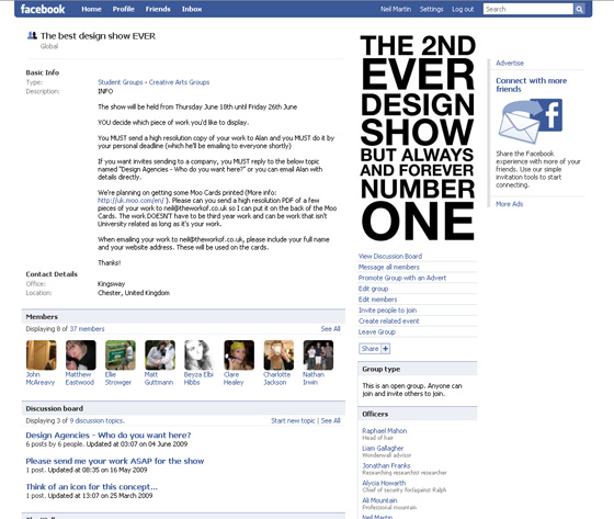
It all started at the beginning of March, when the class were told about the exhibition and the need to form a design committee to help organise and produce the show. A group of seven students originally volunteered to help steer the production in the right direction. Over the course of the next few months, we’d slowly begin to develop the show. To help with this, I set up a Facebook group and liaised with the tutors to send out an email to everyone asking everyone to join it so I could keep the class up to date with developments.

Facebook group for the exhibition

We invited the whole class to begin coming up with themes for the show. Something that the design committee could work with to develop invitations, posters and anything else that was needed. We gave people two weeks to develop their ideas into A3 boards and then discuss them with the rest of the class. This proved to be incredibly successful and from this, the idea of using exaggerated facts and figures was chosen.

The committee begin coming up with a range of facts that could relate to design students and their three years at University. This included ideas, hangovers, swearing, paper pads and computer crashes. These facts were then given large figures, based on one person’s experiences, multiplied by 60 (the number of people on the course). So where the average person may have 20 coffees a week, 60 people will have nearly 200,000 over the course of three years. What was clear after coming up with these facts and figures was that there was one fact that would always remain at 1 – the design show itself. This realisation helped to steer the project into the interesting direction of thinking about the exhibition as a culmination of three years. A filtering of ideas, good times, bad times and arriving at one design show, hence why the show was given the name “One Design Show”.

The idea of the past three years being filtered into one show made me think of how it had been tapered to a point – the point being the show – and this gave me the idea of making the invitation a triangle. Something that had a (literal) point to it. Using a triangle for an invitation would give added impact when sending out to design agencies and colleges because how often does someone recieve a triangle-shaped piece of mail?

One of my tutors had mentioned in passing that the previous year’s students had managed to make the invitation its own envelope and this was something that I also wanted to do to so I began to experiment with triangles and how they could fold up into an envelope to keep it secure.

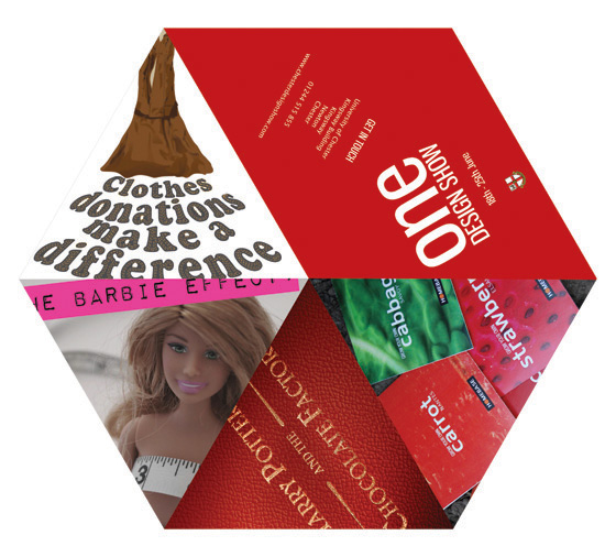
An initial idea for the invitation for One Design Show

The first idea consisted of a hexagon, with a cut from the centre to the edge. The invitation would then fold up into a concertina, leaving a triangle shape. The problem was that in order for this to work, there needed to be enough copy/image to fill 12 pages (six triangles on one side, six on the other) and this proved to be too much and not necessary. This design also meant that a separate envelope was needed. Additionally, because there was a lack of bleed area between the triangles, it meant that some of the artwork was bleeding into another triangle. In short, the idea failed, but the concept was there.

Sticking with the triangle idea but simplifying it, I decided to try it with three panels next to each other instead. This was much easier to handle and it meant that by adding a tab at the end of the triangles, I could fold the whole thing up and the tab would secure it in place, thereby forming its own envelope. I went with this shape and started on the design work.

The numbers for each of the facts were quite big. I wanted some way of trying to relate these big numbers back to a digital medium and the obvious choice was pixels because that’s what any piece of artwork is made up from at some point or another before being printed. I have always enjoyed the work of people like eBoy and their method of using pixelation as an art form. I wanted to take this and try and make it work on a larger, invitation and poster-sized scale. For this reason, I decided that iconography would be great to use.

The original set of icons and one blown up.

I love working with iconography. It forces you to be economical with your design because you only have a 16x16px area to work with. Communicating a computer crash or a hangover in such a small space is quite an interesting project on its own but I had to make the icons work at print resolution. When a 16x16px image is printed at 300dpi, it is less than 3mm in width. This meant that the icon would need to be blown up if it was to be seen. However, by blowing something up so small to such big sizes, it was inevitable that they would look blurry and messy. Photoshop’s default method of resizing images is “Bicubic”, which is useful for things like photos. However, Photoshop also has another resize method called “Nearest Neighbour”, which allows pixels to stay sharp at larger sizes even when resized to ten times its original size.

The icons that I designed, although nice lacked colour and so a few of them were eventually redesigned including a red coffee mug instead of a white coffee cup and a few of these icons were using on the invitation that can you see on the project page.

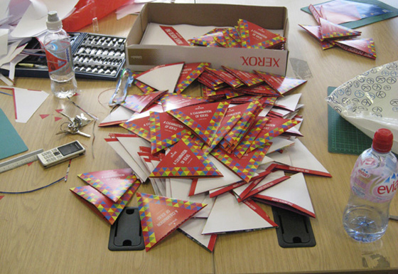
Once the invitations were designed, it was then a case of finding a quote from the printers. The design department didn’t have a large budget to spend on promoting the show and tasked me with finding a suitable printers to print 400 copies of the invitation. Luckily, the invitation was small enough that two would fit on one A3 page, which meant that it immediately cut the costs in half. Unfortunately, due to the unusual shape of the invitation, they could not offer diecutting for price inside the department’s budget and this meant that I, along with a few other people were tasked with cutting them manually.

400 invitiations manually cut and ready to be sent.

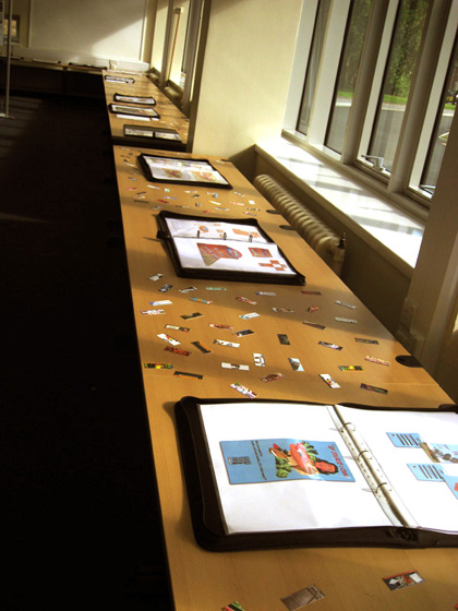
After the invitations were taken care of, the next thing was Moo Minicards. At an early stage of producing the show, I had remembered a great website called Moo. They offer business card-like cards, slightly smaller called Moo MiniCards. I thought these would be a great addition to the show, allowing someone to take something away from it and keep a piece of student’s work with them. My idea was to put a piece of student’s artwork on a total of 100 cards and order 5 packs of them. Each pack costs just £10 so it was well worth it. I requested that all students send me three pieces of their work with their full name and website address. These cards were then scattered all over the tables between each student’s portfolio, making the tables come alive with colour and inviting people to pick them up and look more closely at the work.

Moo MiniCards scattered all over the tables.

The next thing to design were the posters which would help direct people to place in which the exhibition was being held. Originally, the idea was to produce 5 x A1 posters that would be easily visible around the campus. However, after walking around the campus and figuring out where the posters would go, it was clear that more than 5 would be needed. The budget didn’t allow for this. Instead, the posters were designed at A3, which meant that more could be produced and a fraction of the cost of 5 x A1 poster. A series of 8 posters were designed and printed twice, giving me 16 posters to place around the campus in preparation for the opening night.

So as to identify each piece of work on display, nametags for each exhibition stand were designed in the same style as the invitation and placed above each stand. Although a very simple part of the whole production process, these triangles, like the invitations had to be manually cut out of card.

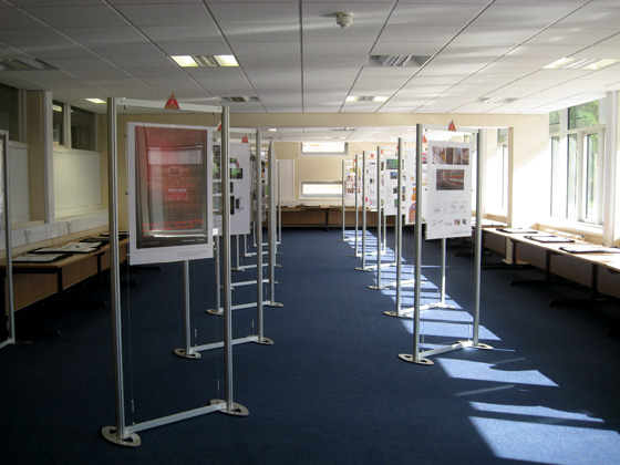
The exhibition, ready for opening night.

Finally, a simple website was designed by myself and built by Liam Gallagher, another student on the course, that housed a few student’s work, descriptions of it and information on the show itself including when it was open and how to get there.

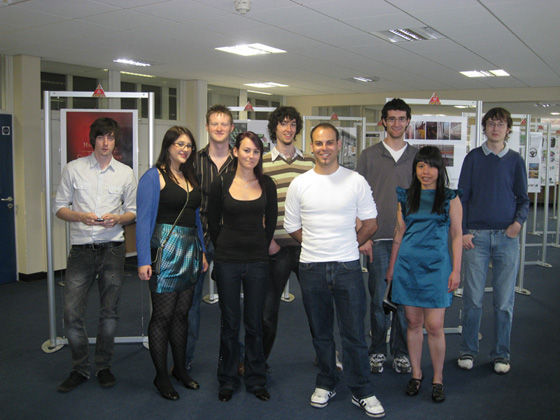
A few of the students who exhibited and/or helped with the show.

Overall, producing the University of Chester’s graphic design show was a really good experience. Liaising with so many people about so many different aspects of the show proved to be very difficult at times due to other coursework-related committments, but I believe that the end result was executed well. In particular, I was really happy with the quality and popularity of the Moo MiniCards that I had designed. As mentioned, I had a total of 500 cards printed and by the end of the seven day opening period of the exhibition, there were less than 100 left. Also, I was pleased to overhear some of the public who attended the opening night of the exhibition express their approval of the posters I had designed. It’s always nice to hear that something you’ve designed has been met with praise.

I’ve really enjoyed working on such a large scale project and I hope that I can do so again in the future.

How to put your customers off

expressperts

krazypizza
Would you order pizza from this guy?

In my last post about fast food leaflets, I wrote about how clarity of information is key to getting as much business from your potential customers as possible. This post is about how to turn them off.

Last week, I recieved this leaflet through my door and it certainly stood out from the usual fast food leaflets I recieve. Would you really be attracted to food with spiral eyes and a mouth, serving what appears to be a slice of himself to you? I find that quite off putting. Disturbing, even.

And then there’s that header. “The pizza delivery expressperts”. Perhaps it’s just me, but trying to combine two words like that while worth a try at the design stage, is certainly not good enough to put on the front of a leaflet, regardless of what it’s for. You do have to wonder who designs these things and, more importantly, why the client signs off on it.

To their credit, “Krazy Pizza” have one of the clearer menu designs inside, but the leaflet’s cover would put me off. It just doesn’t look healthy at all, does it?