
In my last post about fast food leaflets, I wrote about how clarity of information is key to getting as much business from your potential customers as possible. This post is about how to turn them off.
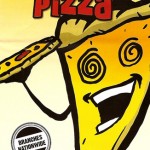
Last week, I recieved this leaflet through my door and it certainly stood out from the usual fast food leaflets I recieve. Would you really be attracted to food with spiral eyes and a mouth, serving what appears to be a slice of himself to you? I find that quite off putting. Disturbing, even.
And then there’s that header. “The pizza delivery expressperts”. Perhaps it’s just me, but trying to combine two words like that while worth a try at the design stage, is certainly not good enough to put on the front of a leaflet, regardless of what it’s for. You do have to wonder who designs these things and, more importantly, why the client signs off on it.
To their credit, “Krazy Pizza” have one of the clearer menu designs inside, but the leaflet’s cover would put me off. It just doesn’t look healthy at all, does it?
