
Firstly, I hope everyone is having a good new year. Welcome to 2010. That’s “twenty ten” and not “two thousand and ten” according to the American National Association of Good Grammar (NAGG).
To kick off January, here’s a new identity for Impossibly Stupid, a blog run by Doc O’Leary. Doc writes about many things, but with a particular interest in some of the mindless things that people do that make you think “Well what was the point of that?”. Here’s his original logo:

It’s not actually that bad of a logo, but it was lacking communication between it and the blog name.
This was a very short project, but one which still required the sketching of ideas between any digital work was done. I started by trying to incorporate the ‘i’ and ‘s’ of ‘Impossibly Stupid’ into one solid logo and I think this is where a lot of logo designs start from. Some are fantastic, others don’t work at all. I also tried to play with the idea of taking one step forward and two steps back to reinforce the idea of something being stupid.
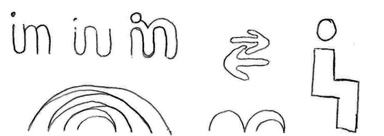
That wasn’t really working as well as I had hoped it would so I moved onto something else, playing with the simple equation of 1+1=3. Something so obviously wrong that everyone knows it’s wrong. It was a simple equation, but one which I felt reflected the tone of voice of Doc’s words perfectly.
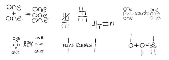
I tried a number of variations of the equation, trying to design it in such a way that it looked more like a graphic, rather than numbers but I found that the message became too complex, making people look for the connection between it and the name.
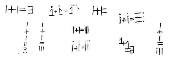
I also tried different placements of the equation, including a vertical alternative.
But in the end, I came back to something much simpler – I+I=III
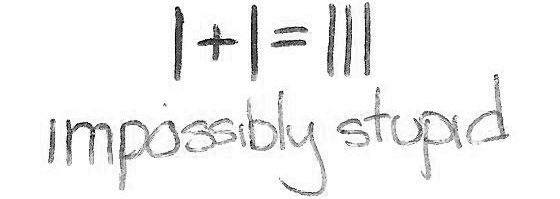
Using ‘I’ instead of ‘1’ and using ‘III’ instead of ‘3’ helped the logo to stay unique and relate back to the name. With three ‘i’s in the name, it just gives a little nod, but not so much that it’s too obvious.
From the final sketch design, I then worked in Illustrator to refine it, trying different varations. The final logo:
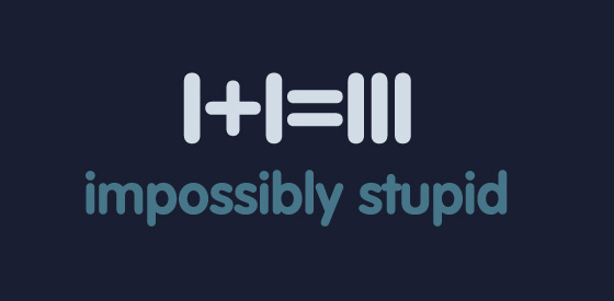
I manually kerned the equation using VAG Rounded as a basis for the numerals. I also enlarged the plus/equals symbols and tightened up the words a little bit so that the logo as a whole wasn’t too elongated.
Doc was very happy with the final result and was kind enough to leave a permanent credit link back to my site, which I appreciate.
A quick, but enjoyable project to work on and one which had a very simple solution!
