A few months ago, I received a black, A4 plastic envelope through the post. The envelope was heavy and looked quite ominous. You don’t get black plastic envelopes through the post every day.
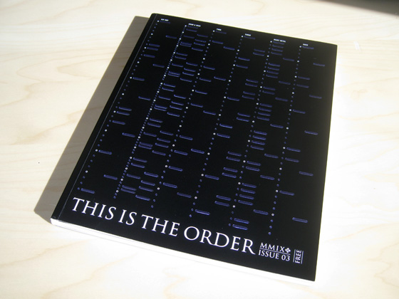
Inside was a magazine. A magazine that was rather thick and could quite easily pass as a softbacked book. This Is The Order. Issue 03.
For a few minutes I wondered why I had received this book. The quality of its design proved that it wasn’t just a random mailshot. And then, having taken a look at the following pages, I realised it was from the makers of Relentless. Yes, the energy drink. I remembered that I had signed up for something on their website months previously about receiving a magazine. I expected a few pages of token information about their products with some half hearted stories about something to do with energy. I was quite clearly mistaken.
The front cover itself was enough to pique my interest.

As the introduction on the first page explained, this issue was all about sound and to promote that, their cover employed a series of raised bars that, when someone ran their fingernail over them, produced a sound that reflected a different music beat.
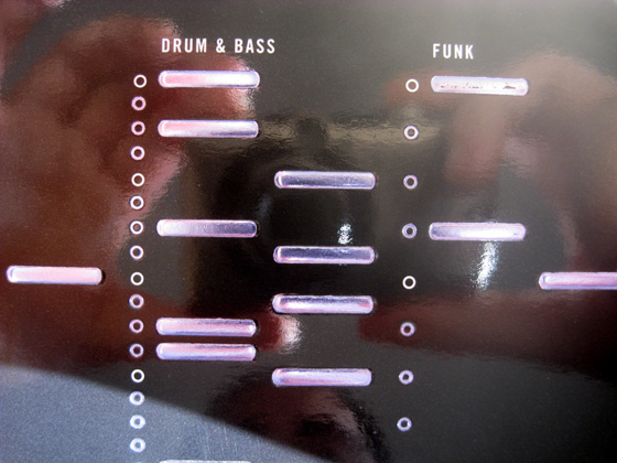
I can’t say that the bars truly reflected any sort of beat you’d hear with actual musical instruments, but certainly the experiment and the implementation of the cover made me smile and made me explore the magazine further.
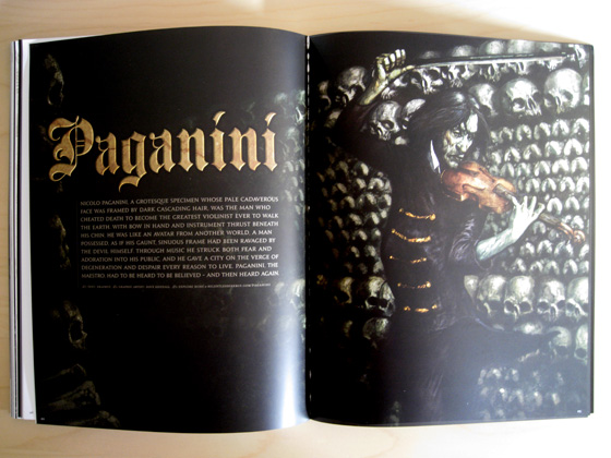
As mentioned, the first page details the front cover, while on the opposite page, there is a fantastic illustration, complete with gold overlays.
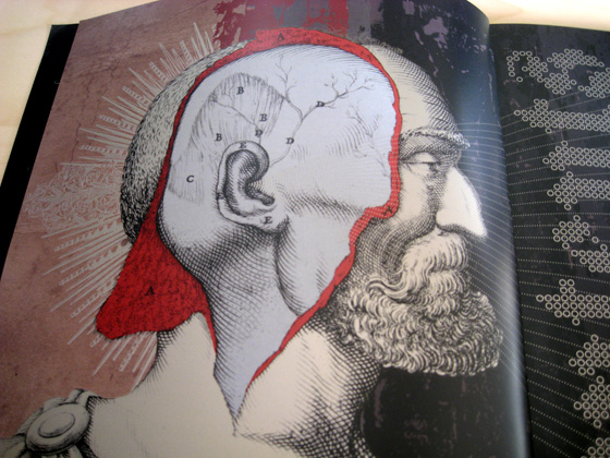
Relentless’s style is one of exaggeration. On all of their marketing materials and indeed on their drinks cans themselves, it’s always designed with a sense of “You are everything. This is amazing. We are beautiful”. I’ve never really been able to tell if it’s tongue in cheek or not. Whether they’re serious about or not, the design and tone of voice they employ is fantastic and I’ve always been a fan of it.
Throughout the rest of the magazine, the design changes according to whatever is being discussed on that page. It doesn’t feel like the magazine has an overall style, but rather, has many styles suited to the content on that page. Usually, I hate this because it makes everything feel disjointed, but when the magazine is all about freedom and expression, I can understand how and why it works here.
Nowhere in this magazine is Relentless mentioned. In fact, the only way you can tell this is produced by them is their trademark serif typography and overexaggerated style. Nowhere in this magazine do they refer to anything product-related or anything that gives you a sense that they’re trying to shift a few units of their products. Instead, the magazine focuses solely on what their product is meant to stand for.
Digression
Businesses seem much more open to doing this in the last few years with the likes of Nike now a lifestyle, not a brand. My favourite example of this sort of “values before product” advertising was earlier this year in the form of a short film by Spike Jonze, funded by Absolut Vodka entitled I’m Here. At the heart of it, it is a simple story about what you will do for someone you love more than anything. It doesn’t promote Absolut or feature the product. The only place you’re likely to find any sort of branding is a small footnote at the bottom of the film’s website.
At 30 minutes long and with a top director, this isn’t just a quickly whipped together production to cash in and sell some vodka. While Jonze can be credited with actually making the film look as it does, Absolut can be credited with wanting to spend such a large amount of cash on something that doesn’t tell people to buy their product. Instead, it tells people to buy their lifestyle. Their values. In other words, you don’t need to tell someone to buy x product. If you can get them to believe in your values, they will always choose your product over another.
End digression
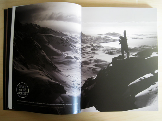
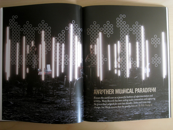
Throughout the magazine, their are double page spreads promoting “Lives of the Artists”, a documentary produced for Relentless about people with a creative passion. The shots they use to promote the documentary are fantastic.
With the full page photos and designs comes the smaller, less often noticed page devices. Like the larger pieces of design throughout the magazine, these smaller pieces seem well thought out and really add to the overall experience of reading the magazine.
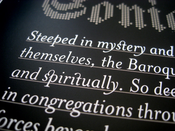
The same can be said of some of the typography used throughout the magazine, with its less often used ligatures.
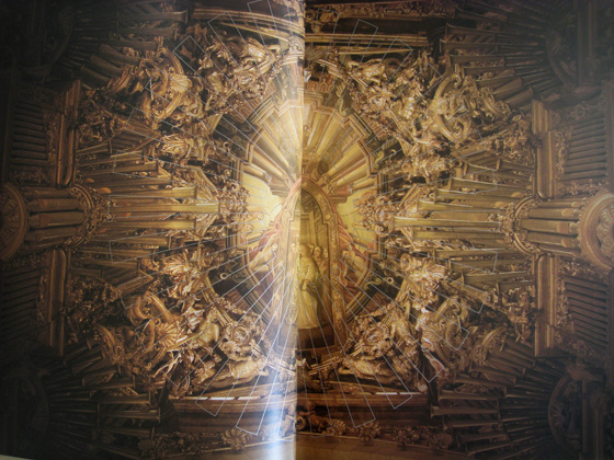
My favourite page in the book is towards the middle. While the preceeding page is an article, the page after is a fantastic double page spread of an amazing ceiling. Because its full page with full page, you can really appreciate the beauty of the ceiling.
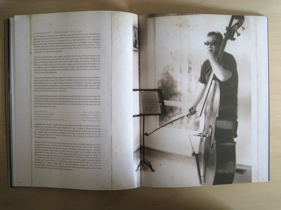
As mentioned, the magazine does a really great job of presenting information in a readable, but visually appealing way, using extra background textures and details to frame the content.
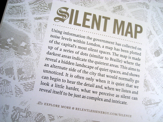
The emphasis on exploration of sound is found on one of the later pages in the magazine, which attempts to map London by how quiet a certain area is.
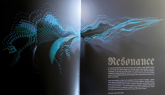
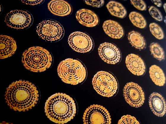
Additionally, there’s also pages which try to visualise sounds in different ways.

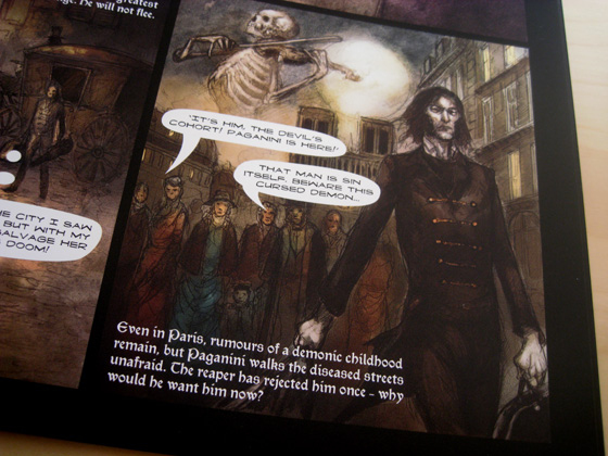
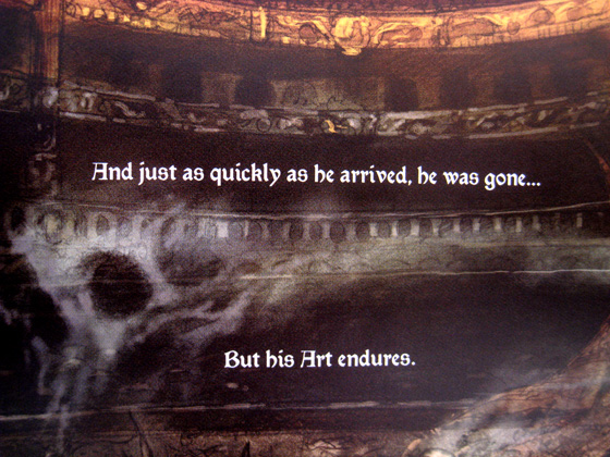
The last few pages of the magazine are dedicated to a short comic, beautifully drawn, that details the story of Paganini, a violinist. It’s a really nice way to end the magazine and it feels as if it’s been thoughtfully added, rather than tacked on at the last moment.
This is the Order is a fantastic magazine, one which certainly caught me by surprise. I’m looking forward to receiving the next issue.
