As part of one of my final University briefs, I’ve been working on developing a new line of packaging for seeds for Homebase’s new brand that encourages novice gardeners to grow their own fruit and veg. It’s been a quick, but very ‘fruitful’ project. I’m really happy with the finished packs. You can see the full project here.

As someone who doesn’t have any experience with any form of growing my own food, I found this project to be particularly interesting because while researching, I was doing it as both a designer and as someone who Homebase would be targetting i.e. someone who may be put off by the thought of digging about in the garden.
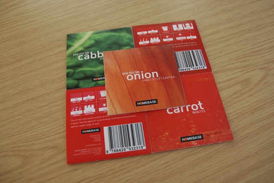
As you can from the above photo, the packs are designed to be as colourful as possible and focus on the richness that can be found within any food that can be grown yourself. The images used on the front of each packs are super-high resolution (2,400 DPI) scans of fruit and veg. It’s amazing to see how detailed food can be when looked at so minutely. The front of the packs are stripped of any uneccessary information to simply attract as many people as possible. All information can be found on the back of the packs.

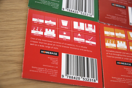
The packs measure just 7.5cm². This reduces the size of the packaging by half compared to current seed packaging and makes it stand out. Because of this reduction in size, a lengthy description of how to use the seeds would be both impossible and unwise, as it would turn potential gardeners off. Novice gardeners do not want to be overwhelmed by lots of instructions. Instead, a system of iconography was developed to better communicate with consumers. This reduces text to an absolute minimum, while keeping all important information visible and easier to understand by using iconography instead.

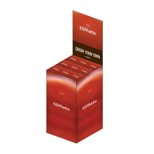
I also designed point of sale for the packs, further encouraging people to purchase them. The point of sale uses the same high resolution photography for each type of seed. Each type of seed has its own point of sale, which when placed next to each other creates a block of texture and colour that would stand out in any store.
I’ve really enjoyed this project. Packaging is something I’m very interested in designing. Sometimes, even though the product (in this case seeds) is fairly generic, you can really make it shout out by employing some strong design and by designing the physical packaging in a way in which isn’t currently being used. If your packaging looks different to everyone else’s, it’s bound to get seen and remembered far more than your competitors. Give it a go.
